Mistake Made By Developers(Is PX better than REM?🤔)

Hello Friends 👋🏻, My name is Madni Aghadi!! I'm 18 years old, learning to code, and I'm aspiring to be a full-stack developer. I am skilled in C, C++, HTML, CSS, Bootstrap, and Javascript, and I am constantly learning other programming languages.
INTRODUCTION
👉Do you know what professional developers used in their projects? They mostly use rem and they try to neglect the use of px as much as possible. Rem can be used to create a responsive design, on the other hand, px may be a hindrance to your responsive design! But How🤔?Here's the whole explanation👇
👉If you are intermediate or professional you may know the uses of rem and what problem can be created by the use of px. But, the beginners mostly use the px, most don't know what is the exact meaning of px but they use it by their assumption or they know that 1px=1/96 of an inch. Have you ever wondered how big the px will be when you put in your websites? Now let's come to our point. Let's take an instance to understand it better.
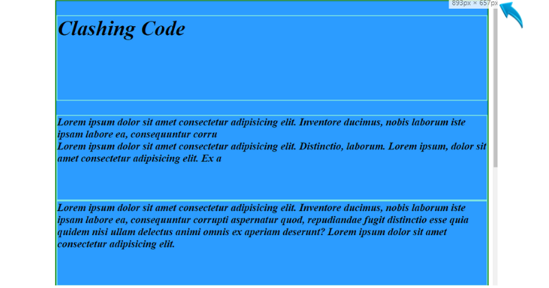
👉 IMAGE NO.1
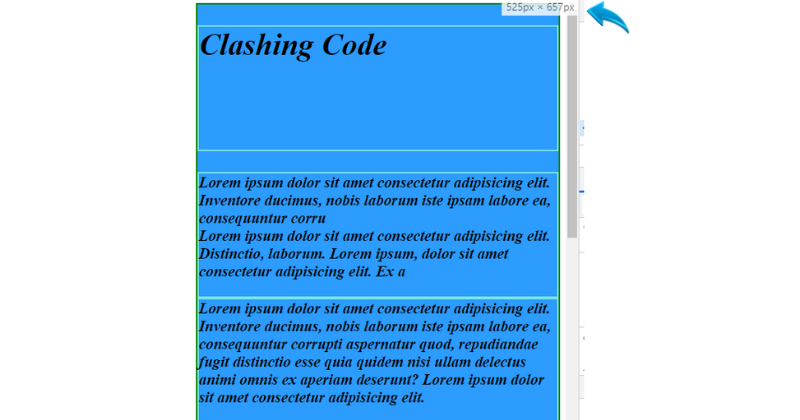
👉 IMAGE NO.2
Why REM?
👉Here you can see that when the screen reaches one specific breakpoint on Image 2, the font seems to be larger, for this issue we can use a media query to solve this problem by defining the font size or font weight to all the individuals like p,h1,h3, etc. But the question is how many times you will determine the property under media queries again and again? Is there any alternative to solve this issue? so the answer is yes🙂.
👉You can go for rem. here may your question will be, How we can solve this issue by the use of rem?
Meaning of REM
👉Let me tell you the meaning of rem:- It sets the size of the element relative to the root element(In our case it is HTML TAG)
How to use REM?
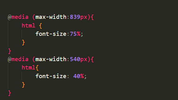
👉The default size of the root element is 16px in most browsers(1rem =16px), But you can change the size of the root element(HTML Tag), this is why we have an advantage here and most professionals prefer rem. You can use rem in the replacement of px to any selector in CSS, if you specify the rem the size will be of =size of the root element in px rem you have specified(i.e 2rem = 16px 2= 32px). When specifying px, we have to define too many properties in the media query, but after the use of rem, we have to only change the percent of the root element(HTML Tag). Here 100% = 16px,200% = 32px and 50% will be = 8px. You can specify the media query like this👇
✨ Conclusion
👉There are also other relative units like em. But, I prefer and suggest using rem and neglecting the use of absolute units like px if possible.
👉Hope, this will be helpful.
Thanks for READING MY ARTICLE!!
Also, check out my other platforms:
Instagram
Twitter
Telegram
Buy Me A Coffee☕


